 By
By Wallpaper has undergone a massive renaissance, evolving from the muted, repetitive backgrounds of past decades into a dynamic design tool. Today, statement wallpaper serves as a primary vehicle for self-expression in interior design, offering bold scale, vibrant colors, and intricate narratives. Yet, the very traits that make statement wallpaper so captivating—its dramatic visual weight and artistic presence—also make it intimidating. The line between a space that feels masterfully curated and one that feels claustrophobic is notoriously thin.
When executed with intent and careful planning, high-impact wallpaper does not diminish a room; it expands its perceived dimensions, establishes an unmistakable mood, and anchors the surrounding decor. Achieving this requires an understanding of visual balance, scale coordination, and spatial boundaries.
Strategic Placement and Spatial Boundaries
The first step in managing a powerful wallpaper design is determining exactly where it will live. Restraint in application is often the defining factor in whether a pattern succeeds or overwhelms.
The Traditional Accent Wall Elevated
Assigning wallpaper to a single accent wall is the most common method to introduce pattern without overstimulating the senses. However, the choice of wall should never be random. The ideal candidate is the natural focal point of the room—the wall behind a bed headboard, the wall framing a fireplace, or the surface backing a main living room sofa. Crashing a bold print into an arbitrary side wall can fracture the flow of a room, whereas placing it behind a primary furniture arrangement anchors the design naturally.
Embracing Architectural Framing and Millwork
One of the most effective ways to temper a maximalist wallpaper pattern is to contain it using architectural elements. Framing wallpaper with wood paneling, wainscoting, or crown molding breaks up the vertical plane and reduces the total square footage of the print. By installing wallpaper only on the top two-thirds of a wall and finishing the lower portion with a solid, complementary board-and-batten or beadboard panel, you instantly ground the pattern. The structural weight of the millwork acts as a visual palate cleanser, allowing the wallpaper to read as a framed gallery piece rather than an all-encompassing canvas.
The Unexpected Fifth Wall
If you want to keep your main vertical walls clean, neutral, and bright while still experimenting with a dramatic print, look upward. The ceiling is frequently underutilized in residential design. Applying a statement wallpaper overhead creates an enclosed, cocoon-like ambiance that works exceptionally well in dining rooms, entryways, and powder rooms. When wallpapering a ceiling, keep the surrounding vertical walls a solid color derived from the wallpaper ground to maintain an open, sophisticated atmosphere.
Mastering Pattern Scale and Room Proportions
A common misconception is that large patterns belong exclusively in grand spaces and small patterns belong in tiny rooms. In reality, subverting these expectations often yields the most balanced results.
Large-Scale Motifs in Compact Spaces
Counterintuitively, a massive botanical, mural-style landscape, or oversized geometric print can make a small powder room or entry vestibule feel significantly larger. Tiny, dense, repetitive patterns can create a frenetic energy in cramped quarters, making the walls feel as though they are closing in. A large-scale motif, by contrast, tricks the brain into looking at the sweeping composition rather than the physical boundaries of the room, effectively expanding the spatial perception.
Managing Visual Weight with Furniture Obstructions
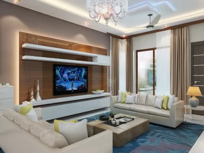
A bold wallpaper pattern does not need to be entirely visible to do its job. In fact, intentionally obscuring parts of the design with substantial furniture items is an excellent curation technique. Positioning a tall bookcase, a high-backed sofa, or a large minimalist media console against a wallpapered wall breaks up the continuity of the print. This layered approach softens the impact of the pattern, turning the wallpaper into an intricate backdrop rather than an aggressive spotlight.
Establishing a Harmonious Color and Material Palette
To prevent a room from descending into visual chaos, the statement wallpaper must share a strict genetic link with every other element in the space. Color discipline is non-negotiable when dealing with high-contrast surfaces.
Sourcing Your Coordinating Hues
When selecting paint for the remaining walls, trim, and ceilings, look directly inside the wallpaper design. Pick the quietest, most neutral background tone from the pattern to use as your primary wall color elsewhere in the room. For a subtle pop of drama, select one of the mid-tone accent colors from the motif and apply it exclusively to the baseboards, window casings, and doors. This creates an intentional, designer-level continuity that makes the entire room feel unified.
Balancing Textures and Materials
Because statement wallpaper introduces an immense amount of visual texture, the physical materials in the room should skew grounding and tactile. Pair vibrant, busy prints with organic, solid surfaces that possess natural variance rather than competitive patterns.
-
Wood: Opt for grains that offer warmth without heavy knots, such as solid oak or walnut, to anchor the lower half of the space.
-
Metals: Use matte black iron, brushed brass, or oil-rubbed bronze to provide crisp, structural lines that cut through the fluid shapes of organic wallpaper motifs.
-
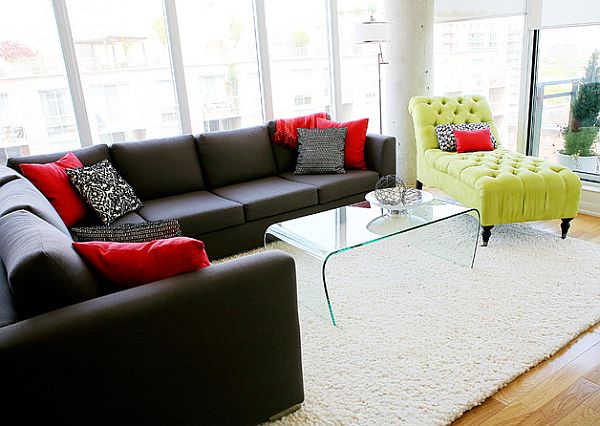
Fabrics: Lean heavily on solid boucles, heavy linens, and smooth leathers for upholstered furniture pieces. Avoid introducing secondary patterned fabrics on sofas or large chairs, which creates friction and competing focal points.
Lighting Considerations and Pattern Interaction
How a room is lit changes how a pattern behaves throughout the day. Shadows and light beams can either accentuate a beautiful design or turn a busy print into an oppressive wall of color.
Maximizing Natural Light
In rooms with abundant natural light, wallpapers with dark or deeply saturated backgrounds appear rich and velvety rather than gloomy. However, be mindful of high-gloss or metallic finishes in bright spaces. Direct sunlight hitting a metallic or pearlescent wallpaper ink can create an intense, blinding glare that distorts the pattern and causes eye strain. In highly illuminated rooms, matte or chalky paper finishes are far more forgiving and luxurious.
Layering Artificial Illumination
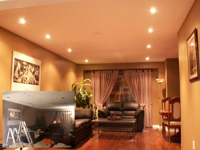
To make a statement wallpaper feel intimate rather than overwhelming at night, move away from harsh, centralized overhead fixtures. Rely instead on layered accent lighting. Sconces mounted directly onto a wallpapered wall cast a soft, localized glow that highlights the paper texture without flattening the design. Use lamps with opaque shades that direct light downward and upward rather than diffusing it outward, creating distinct pools of light that break the pattern up into sophisticated evening vignettes.
Frequently Asked Questions
Can I use statement wallpaper in a rental home without damaging the walls?
Yes, peel-and-stick wallpaper options made from high-quality self-adhesive vinyl or premium woven paper are readily available. These are engineered to pull away cleanly from properly primed, smooth walls without leaving adhesive residue or stripping the paint underneath, making statement designs fully accessible to renters.
How do I choose the right pattern style for an open-concept living space?
In an open floor plan, select a single architectural zone to wallpaper, such as the recessed dining niche or the wall behind the media center. Choose an abstract, organic, or tonal geometric pattern rather than a high-contrast pictorial mural, ensuring the design coordinates effortlessly with the various functional areas sharing the view.
Is it safe to install statement wallpaper in high-moisture areas like full bathrooms?
Standard non-woven papers can degrade or peel away under constant humidity. For full bathrooms with showers, look specifically for scrubbable vinyl wallpapers or non-vinyl papers coated with a protective polymer topcoat. Additionally, ensure your bathroom ventilation fan is rated appropriately for the square footage to clear out steam quickly.
How should I handle artwork and wall decor on a boldly patterned wall?
You can absolutely hang art over wallpaper, provided it offers contrast. Use oversized mats and simple, clean-lined frames to create a distinct border between the artwork and the pattern. Abstract art, black-and-white photography, and structural mirrors work exceptionally well because they do not compete with the complex details of the background paper.
What is the best way to clean and maintain statement wallpaper over time?
Maintenance depends on the paper classification. Most modern non-woven wallpapers can be lightly dusted with a microfiber cloth or vacuumed using a soft brush attachment. For minor scuffs, a lightly damp, clean sponge with a drop of clear dish soap can be used gently on papers labeled washable, but avoid abrasive scrubbing pads which strip the delicate top inks.
Should I wallpaper a room that has low ceilings or awkward architectural angles?
Awkward angles and sloped ceilings are actually excellent candidates for wallpaper. By wrapping both the vertical walls and the sloped ceilings in a continuous, non-directional pattern, you blur the harsh transition lines where the wall ends and the ceiling begins, making the entire room feel loftier and more whimsical.